Panel Recap: Exhibit-Design Eye Candy
January 26, 2023
Last week, Exhibitor Group invited EWI Executive Creative Director Chris Petit to participate in a panel discussion about exhibit and experiential design.
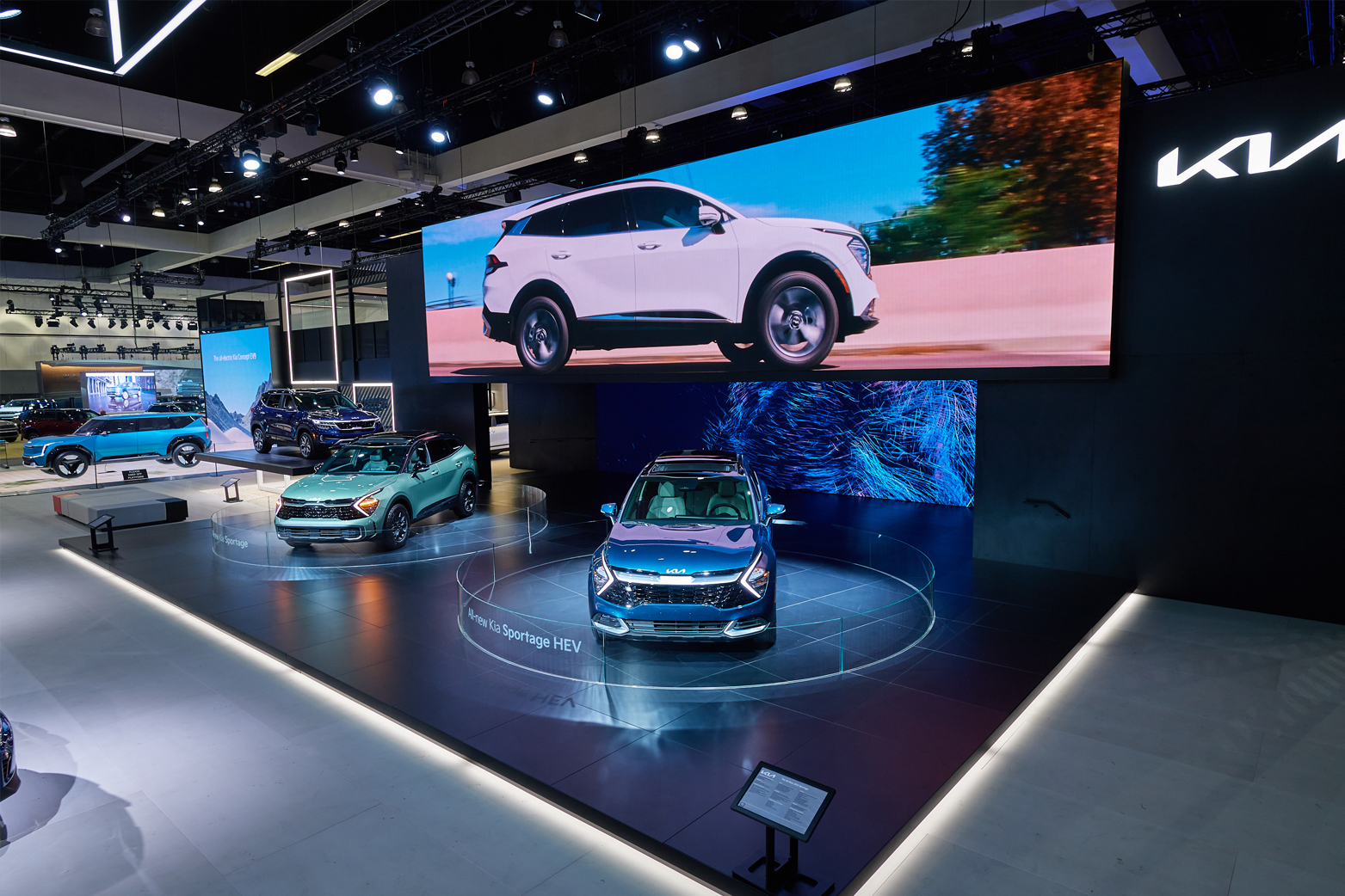
For those who haven’t met or worked with Chris, he led the design of Kia’s new, award-winning auto show experience. Back in 2021, Kia launched a new, reimagined global brand identity. To reinforce the brand’s move upstream in the auto market, Kia needed a new auto show exhibit that exuded the brand’s new purpose: “Movement that inspires.” The design was launched at the 2021 Los Angeles International Auto Show and won a Gold Exhibit Design Award.
The discussion was entitled Exhibit Eye Candy and covered current trends, technologies and best practices in experiential and exhibit design. What follows are a few takeaways from the conversation.
Design with flexibility and adaptability in mind
Most readers probably realize that the best exhibits tell a cohesive, engaging brand story. But building a unified brand experience isn’t always easy when you’re dealing with variables that are unknown (and sometimes unknowable), such as changing show footprints or evolving product lineups.
For this reason, scalability and adaptability were chief design considerations in Chris’s work with Kia. “One of our biggest challenges was having the properties adapt to different shape floor plans and to accommodate a bunch of new vehicles coming in the next coming years,” he explained. “We had to make sure that all of these properties would be equipped to meet their expectations as the brand evolved.”
“We did countless scenarios, spatial tests, [and] ultimately created a family of properties that highlight feature vehicles and digital interactives. And [they] were built in a way to really give us that flexibility of reconfiguration.”
Adaptability and flexibility are important for creating a consistent brand experience. From touchpoint to touchpoint, the best brands tell a unified story. But new variables can throw a wrench in even the best plans if you don’t prepare for such factors ahead of time. By creating a family of flexible, adaptable properties that could be reused, updated and repurposed for future use and in different settings, Kia positioned itself for ongoing success and efficiency in its experiential marketing.

Design experiences in three dimensions
Creating a consistent brand experience across a large area can present a serious challenge for a brand. If the customer’s experience is lackluster or repetitive as they move through the space, audiences will get bored and dwell times will dwindle. (Exhibitor noted that large booths at auto shows can start to “look an awful lot like parking lots” — which isn’t good.) However, Exhibitor judges certainly didn’t feel that way about Kia’s exhibit. Kia’s booth spanned nearly 20,000 square feet, but judges still described the brand’s presence with adjectives like restrained, refined and aspirational.
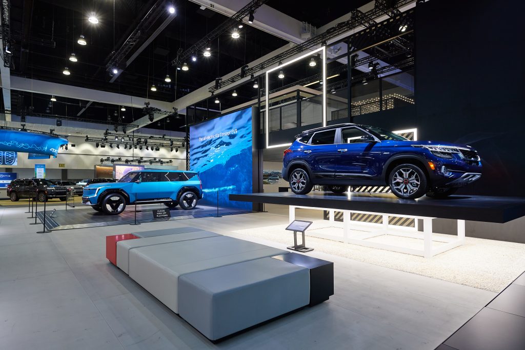
When dealing with large spaces, Chris recommends thinking beyond a two-dimensional floor plan — and leveraging height and 3D relationships between properties to create a sense of cohesion and unity. “It really comes down to the balance and hierarchy between product, the structure, zoning, sight lines and interactives,” he explained.
“As you moved [through] the rest of the space, there was a hierarchy,” he continued. “[Features] were all given different heights, so it felt like you were progressing through the space and it wasn’t all so uniform.”
“We wanted every vantage point, no matter where you stood on the show floor, to have just enough visual elements overlapping to make the space feel connected as one solid brand experience. [The design is] really meant to entice attendees to explore the space and discover something new as they moved about, in and out, around the space.”
Technology should reinforce brand story
Digital engagements are an increasingly important way to connect with modern audiences. And lots of amazing new immersive technologies are being developed that could be used to help brands tell their story. However, digital interactions should be implemented with restraint, as they can quickly become gimmicky or distracting.
“I think as a designer, I mean, we’re not just using technology for sake of technology,” said Chris. “We want it actually to make sense and fit in with the user experience and story we’re telling.”
For example, Chris expressed that many of the VR headsets he sees on show floors can actually get in the way of a brand’s goals to engage lots of customers. Taking five minutes to wipe a headset down and put it on the next person’s head can actually harm — not help — brand impression.
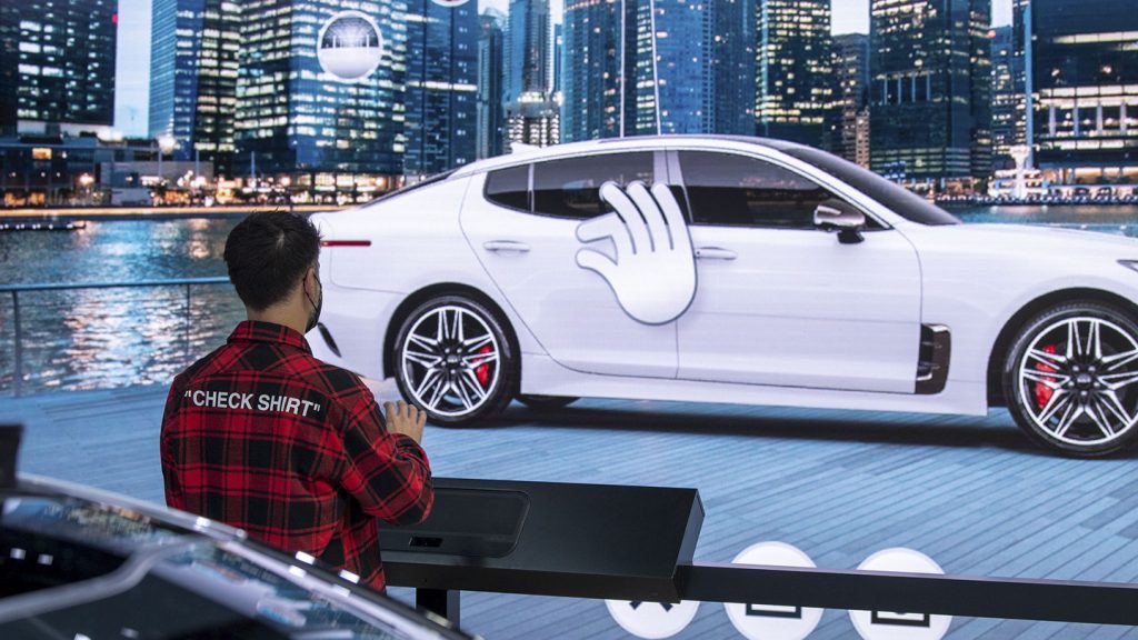
According to Chris, the secret to implementing technology lies in selecting the appropriate tech. For example, EWI’s digital team created a larger-than-life, touchless, interactive color and trim experience unlike anything we’ve ever seen before. Using UltraLeap technology, we were able to project tactile sensations onto users’ hands in mid-air using ultrasound waves — all while they explored different color and trim options of different Kia cars and SUVs.
“I think the key takeaway here is that we wanted to align our user experience with their brand vision, embracing future technologies,” said Chris, “and tying that all back into their tagline: “Movement that inspires.” And we try to do our best to keep true to do that in every part of the experience.”

